
Metrics
Overview
Metrics addresses the growing need for accessible and customizable data visualization tools. The goal is to empower users, regardless of their data visualization expertise, to efficiently translate complex data into meaningful insights through visually appealing dashboards.
The objective of this UX case study is to showcase the process, methodologies, and outcomes of the user experience design for Metrics. As the sole UX Designer, I helped design the app from the scratch with the support and vision of a small team including a co-founder.
Design Approach
The design philosophy for Metrics centers around three core principles: simplicity, functionality, and aesthetics. The primary goal is to deliver a user-friendly and intuitive experience throughout the entire platform.
User Research
I started the research by defining what we want to achieve with the research. What questions do we need answered. What insights are we looking looking to gain. I led the research team, working with a couple of researchers. Conducted extensive user interviews and surveys to understand user pain points and expectations in the realm of data visualization tools.
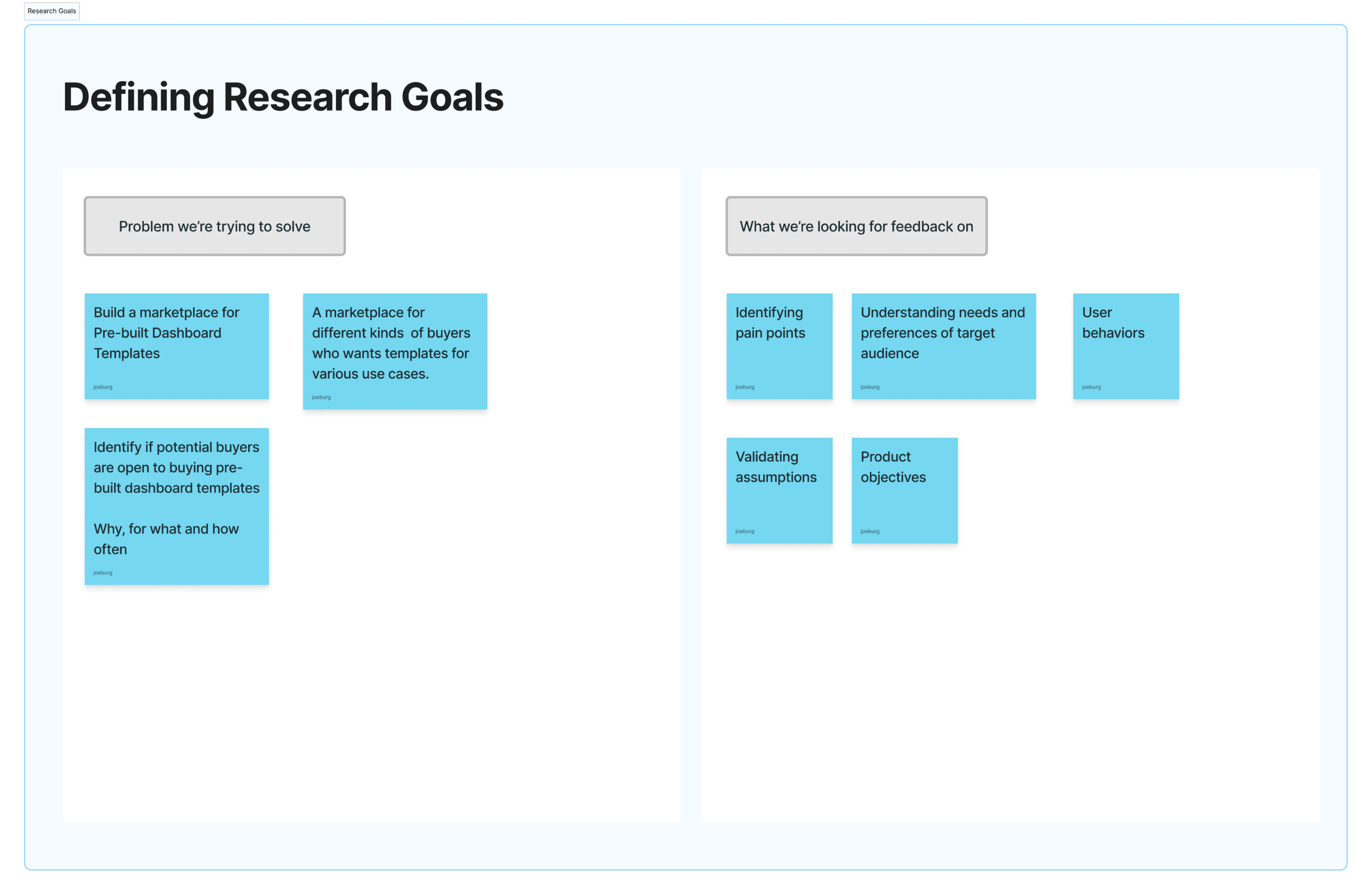
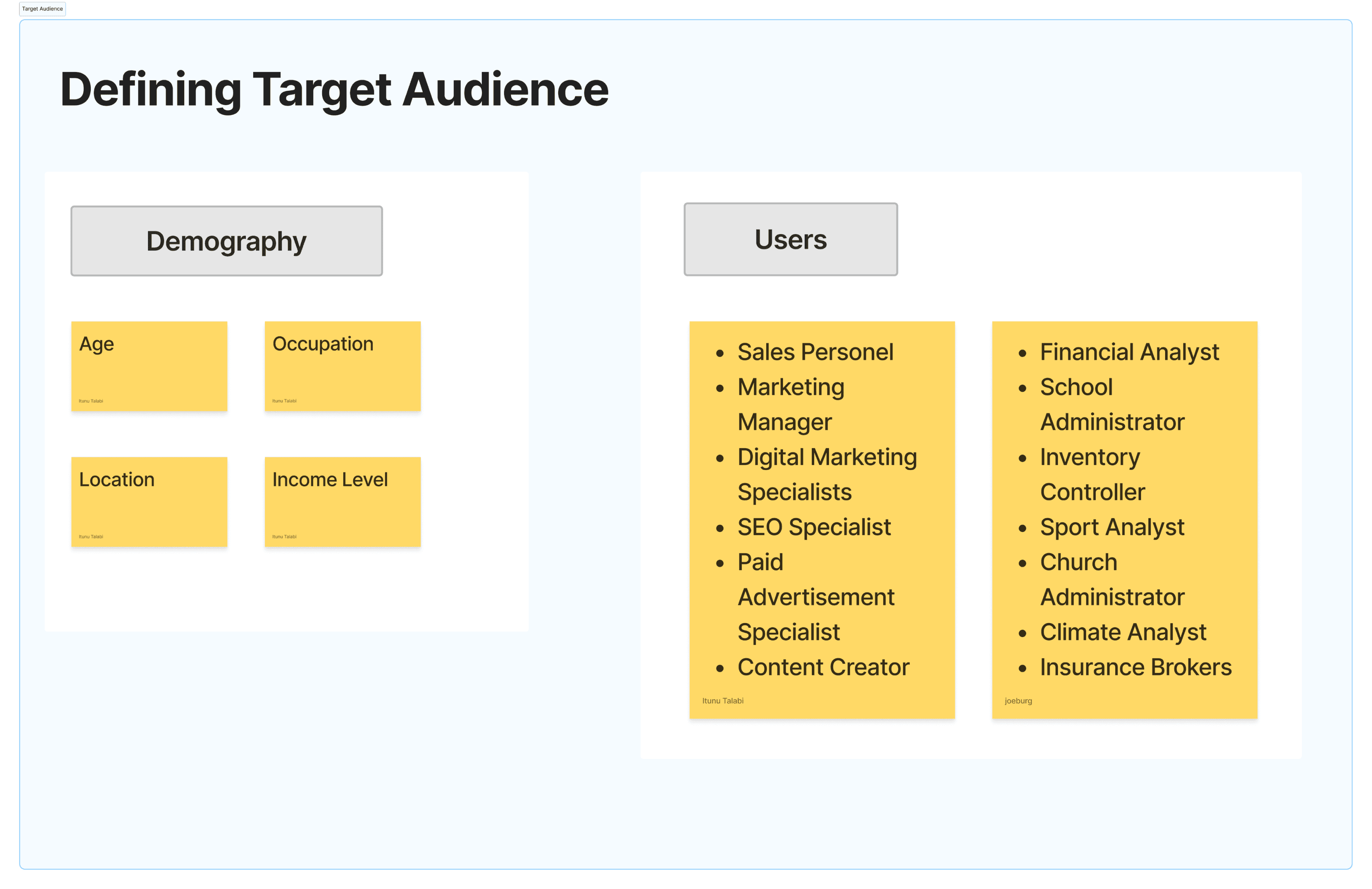


Analyzed competitors to identify gaps and opportunities, shaping Metrics' unique value proposition. We also unearthed a demand for user-friendly, industry-specific templates that offer customization without a steep learning curve.
Ideation
The opportunity presented by the insights gathered during the user research helped me to identify the key problems that require an immediate solution. The problems outlined are highlighted below;
Inability to effectively communicate insights through visuals.
The overwhelming complexity of some data visualization tools.
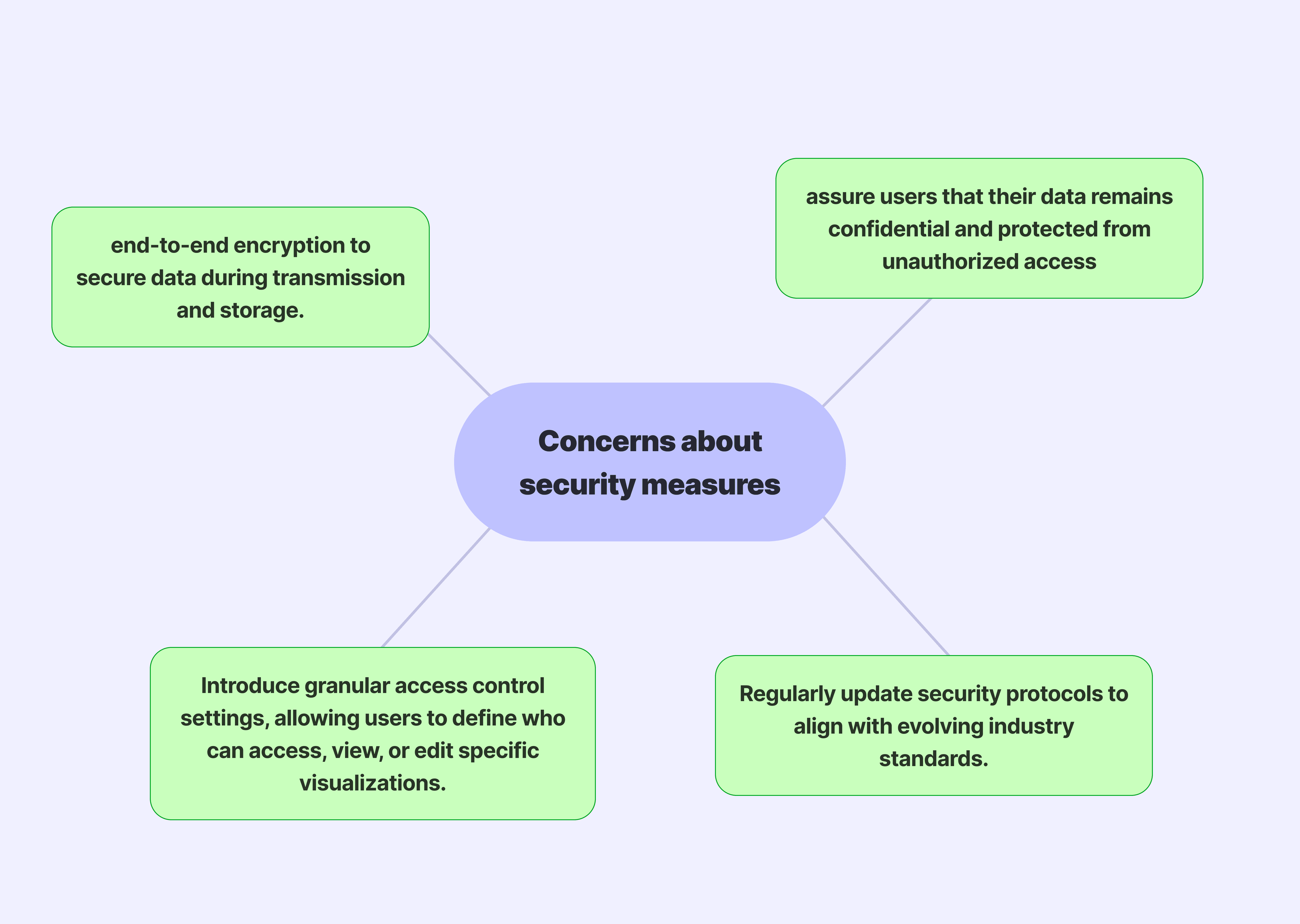
Professionals are also concerned about security measures to protect sensitive data.
After outlining these key problems I was able to ideate on solutions that solves this problems specifically. I used the mind mapping ideation technique to create visuals that might solve each of the problems highlighted and I was able to identify key features from the bubbles. I address challenges related to communication, complexity, and security in data visualization tools. The solutions focus on enhancing user experience, simplifying processes, and ensuring the highest standards of data security.


solution

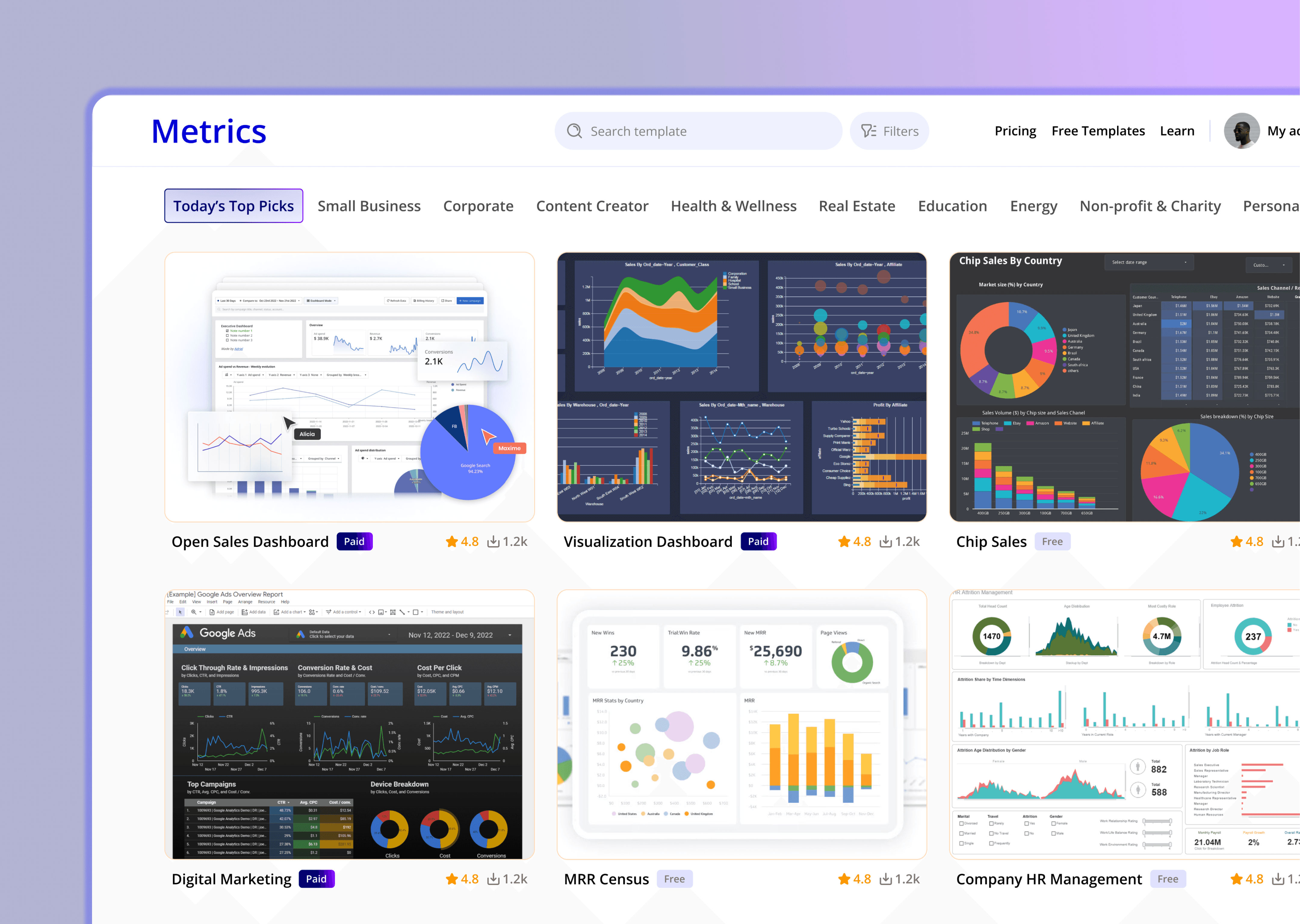
Developed a clear information architecture, focusing on intuitive navigation from the landing page to the pre-built templates discovery.

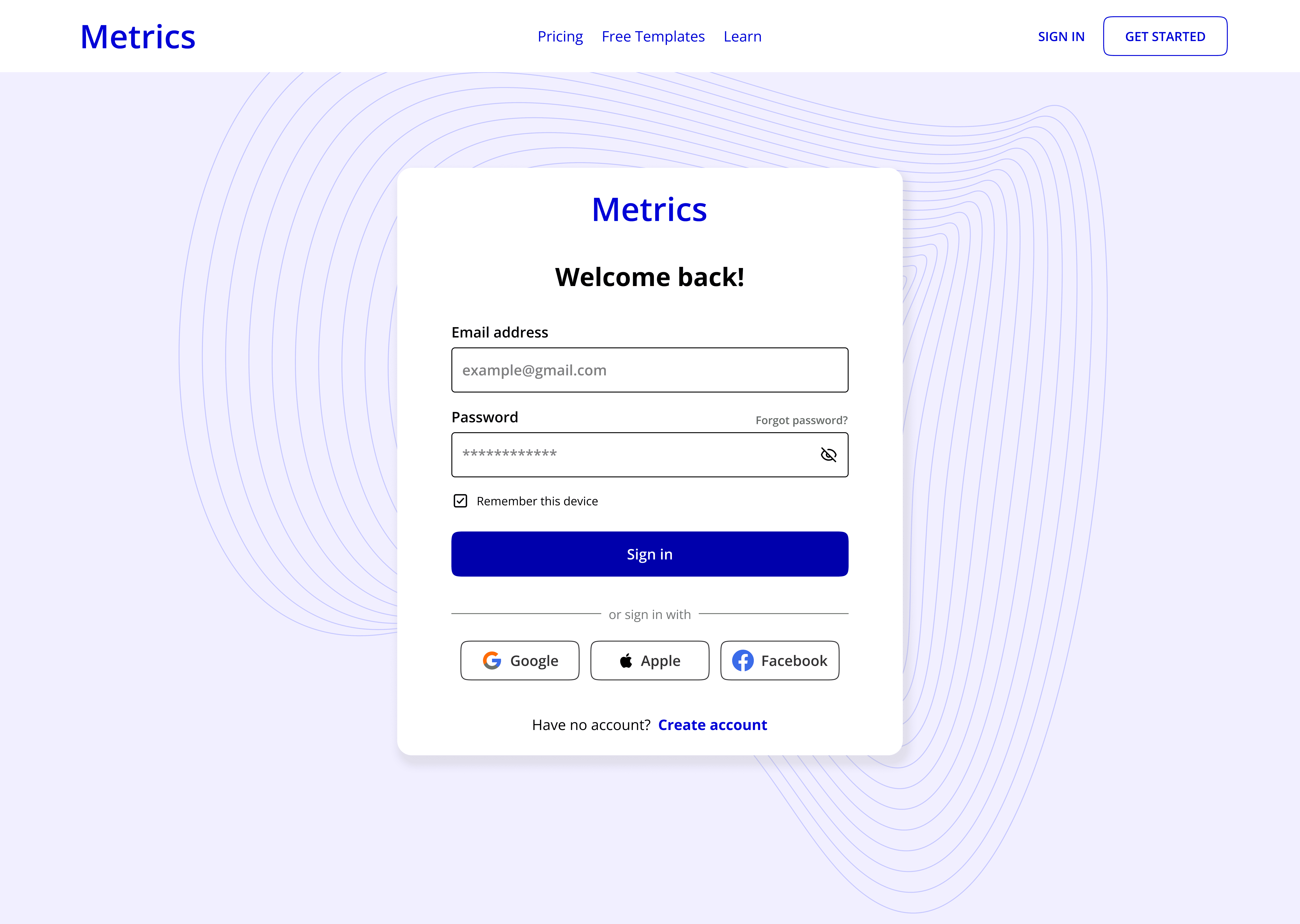
The authentication screens to personalize the platform and assure users that their data remains confidential and protected from unauthorized access.
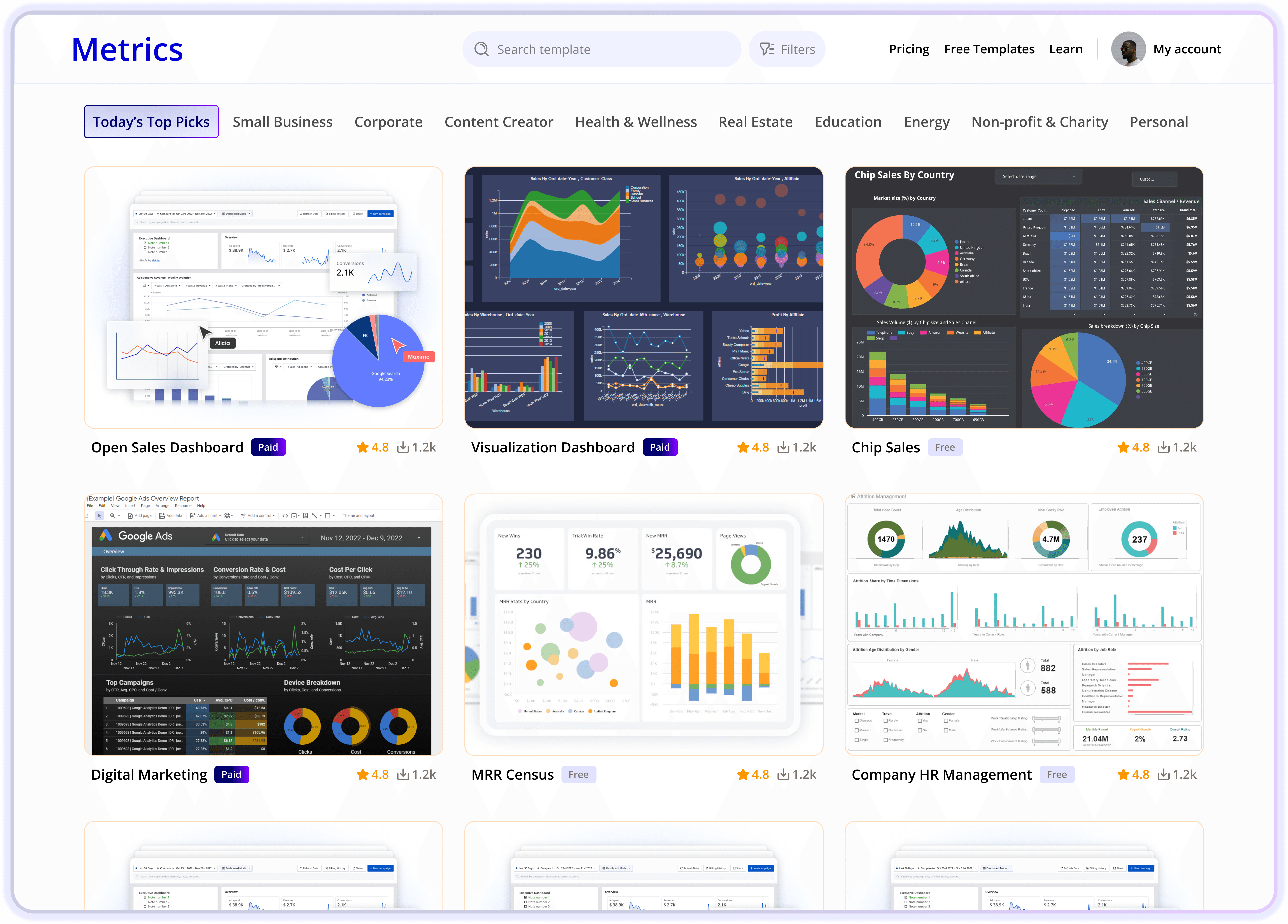
Developed a clear and intuitive information architecture, ensuring easy navigation and discoverability of templates. Structured categories based on industry, data types, and visualization preferences for a seamless user journey.

Users can manage templates their recently used templates and also see a list of saved templates.

Subscription plan screen for users looking to upgrade to premium services. Crafted a visually appealing and consistent design language, incorporating modern aesthetics while prioritizing readability and accessibility. The design aimed to convey a sense of professionalism and ease of use.
Testing and Iterations
Usability Testing: Conducted usability testing sessions at key milestones to evaluate user interactions, identify pain points, and gather qualitative feedback for iterative improvements.
User Feedback Integrations: Prioritized user feedback and integrated valuable insights into subsequent design and development cycles. This agile feedback loop ensured a user-centric approach throughout the project.
Conclusion
By understanding user needs, employing effective design methodologies, and iterating based on real-world feedback, Metrics has emerge as a game changer in the data visualization tools market, providing users with the tools they need to turn data into actionable insights. The journey from ideation to implementation exemplifies a commitment to user-centric design and a continual pursuit of excellence in the realm of data visualization.